

Chime's Bold Brand Refresh Disrupts Financial Norms
Snapshot: Chime's recent brand refresh showcases a vibrant new visual identity centered around its core tools—the card and the app. The redesign emphasizes simplicity and community, positioning the brand as a "portal to progress" for its users.
Although the update seeks to elevate a more mature identity, Chime's playful spirit remains intact through a new illustration style with interactive features like emojis and inclusive visuals.
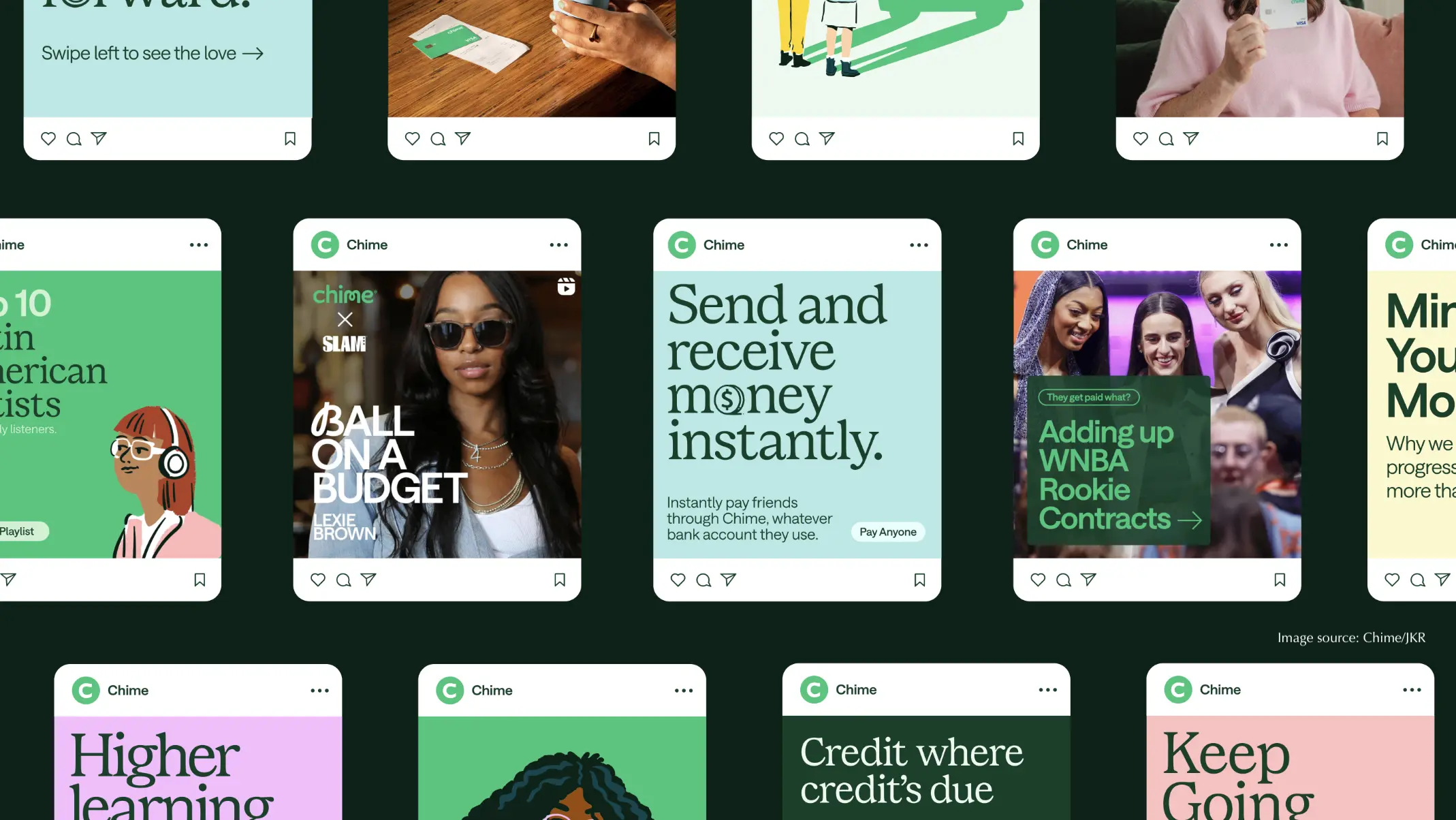
The rebrand focused on typography, expressive lettering, and inclusive illustrations to maintain Chime's friendly essence while appealing to a broader audience. By enhancing the existing green color palette and integrating interactive elements, Chime's identity now reflects both security and modernity.
Key Quote: "Building a more relatable, more inclusive, and more seamless experience for consumers without sacrificing the brand personality is a definite source of pride." Jason Little, Executive Creative Director, JKR
Full story: CREATIVE BLOQ